Stanford CS448B 09 Perception
TLDR
This article contains my notes from Stanford's CS448B (Data Visualization) course, specifically focusing on the ninth lecture about perception. I'll discuss the importance of perception in data visualization, the principles behind it, and explore various techniques for visualizing data, including the use of guides, expressiveness, effectiveness, support for comparison and pattern perception, grouping and sorting data, transforming data, reducing cognitive overhead, and consistency. I'll also cover various chart types, such as line charts, bar charts, stacked area charts, and others, providing examples and discussing their design considerations.
Original
Notes
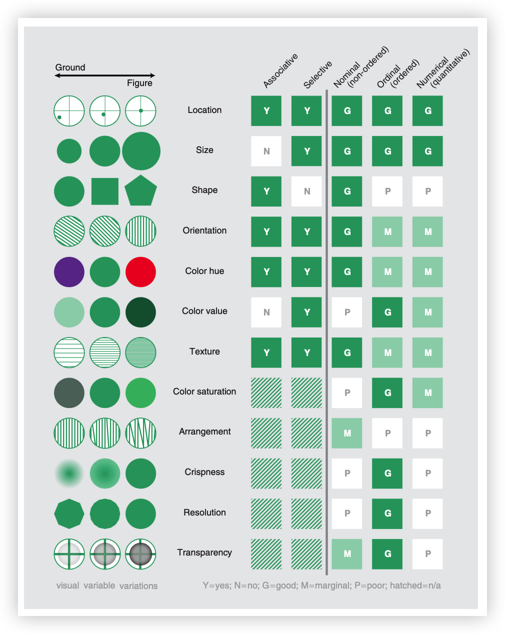
Mackinlay
-
Effectiveness Criteria A visualization is more effective than another visualization if the information conveyed by one visualization is more readily perceived than the information in the other visualization.
-
Encoding Ranking

Detection

Just noticeable difference (JND) is the smallest difference in a stimulus that can be detected.Also be called Weber’s Law.
- Ratios more important than magnitude
- Most continuous variations in stimuli are perceived in discrete steps

Information in color and value:

Sizes standardized in 16th century

Estimating Magnitude
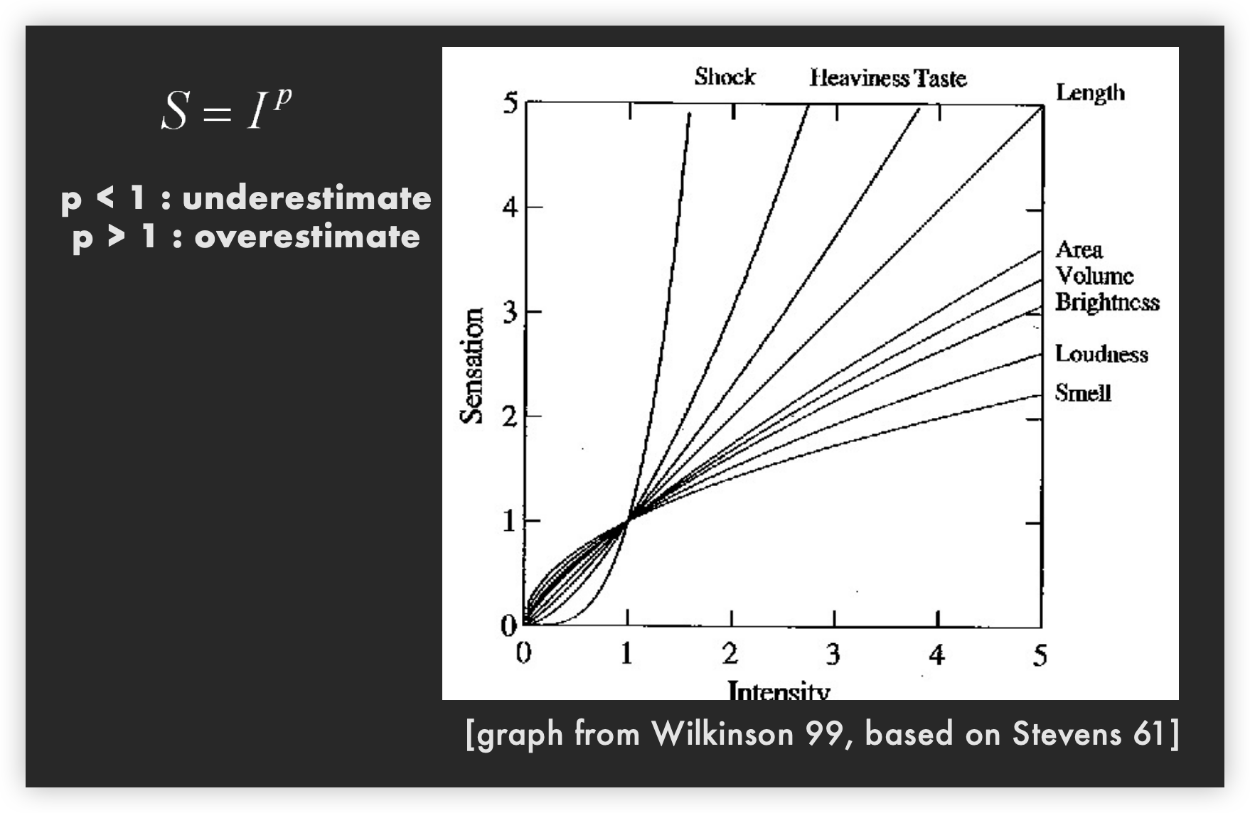
| Sensation | Exponent |
|---|---|
| Loudness | 0.6 |
| Brightness | 0.33 |
| Smell | 0.55 (Coffee) - 0.6 (Heptane) |
| Taste | 0.6 (Saccharine) -1.3 (Salt) |
| Temperature | 1.0 (Cold) – 1.6 (Warm) |
| Vibration | 0.6 (250 Hz) – 0.95 (60 Hz) |
| Duration | 1.1 |
| Pressure | 1.1 |
| Heaviness | 1.45 |
| Electic Shock | 3.5 |
Apparent magnitude scaling

Absolute Symbol Scaling

Flannery Scaling 
Graduated Symbols 
Graduated sphere map

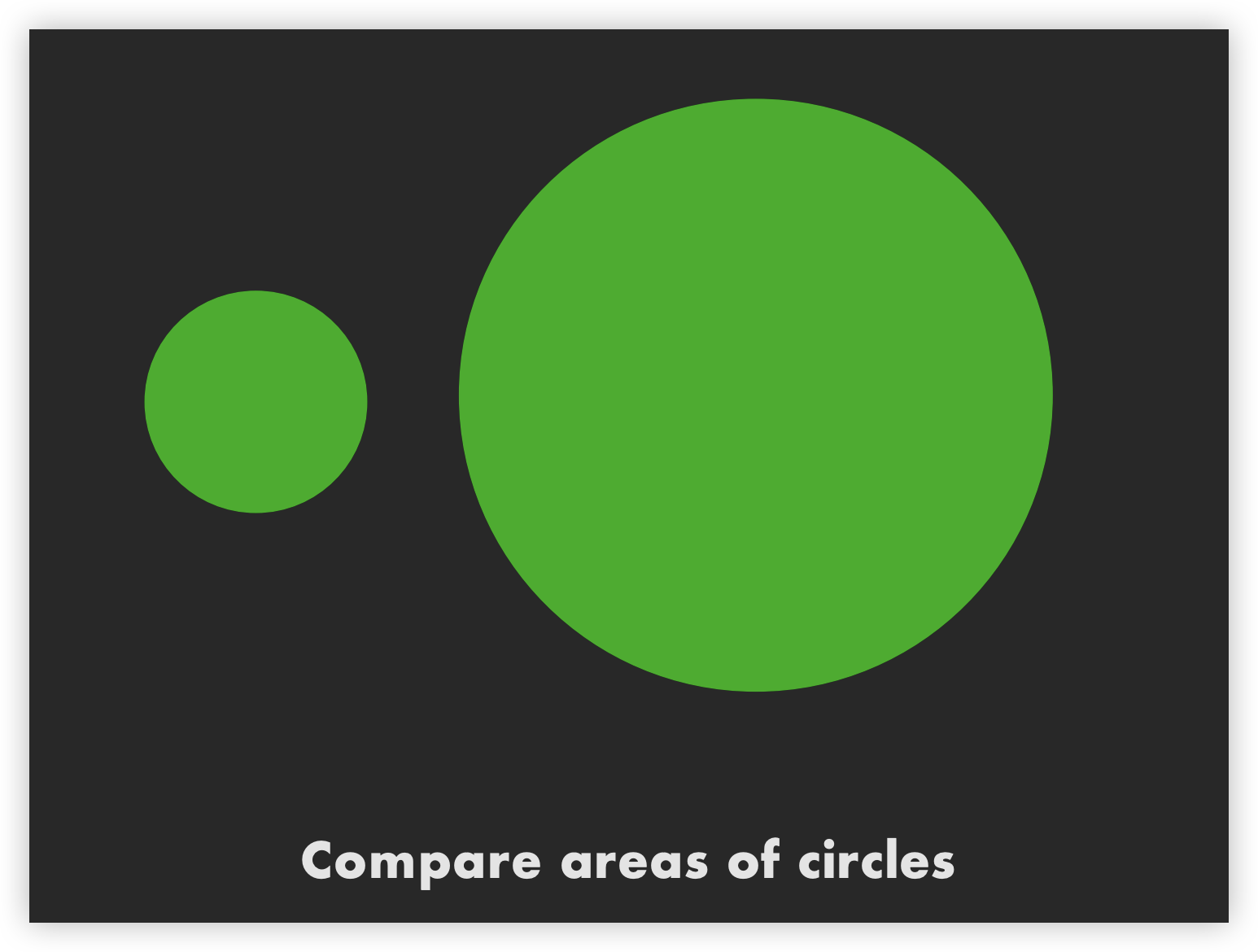
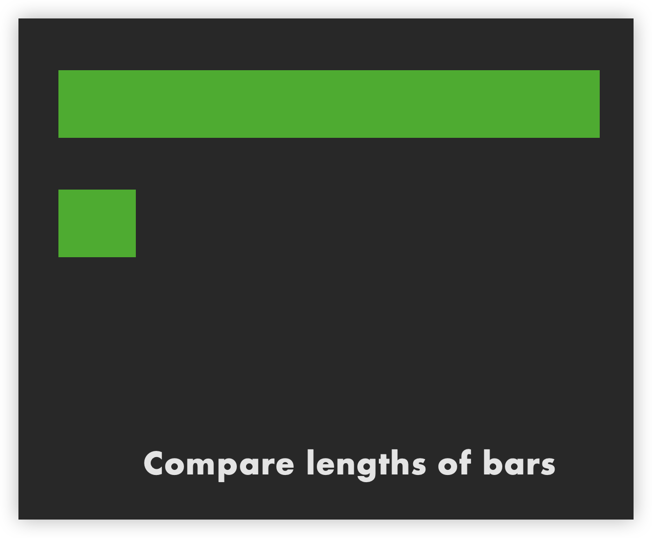
Cleveland and McGill


- Understanding Graphical Perception: The paper explores how humans perceive and interpret graphical information, providing a foundational understanding of graphical perception. This includes studying how accurately and efficiently people can decode different types of graphs such as bar charts, pie charts, and scatter plots.
- Accuracy of Perceptual Tasks: Cleveland and McGill's experiments revealed that different graphical representations have varying levels of accuracy when it comes to conveying information. For example, position-based encodings (like bar lengths in bar charts) are generally interpreted more accurately than area or angle-based encodings (like slices in pie charts).
- Design Principles: Based on their findings, they proposed several design principles to enhance the effectiveness of data visualizations. One key recommendation is to use position encodings over area or angle encodings to improve the accuracy of data interpretation.
- Experimental Methods: Their use of rigorous experimental methods to test the performance of different graphical representations set a standard for future research in the field. This empirical approach provided quantitative evidence for the effectiveness of various visualization techniques.
Overall, Cleveland and McGill's work emphasized the importance of considering human perceptual abilities when designing data visualizations. Their research hasguided the development of more effective and interpretable graphical methods, influencing both academic research and practical applications in data visualization.
Relative magnitude estimation

Preattentive vs. Attentive
-
How many 3's


-
Visual pop-out: Color

-
Visual pop-out: Shape

-
Feature conjunctions

Preattentive features

More preattentive features

Feature-integration theory

Multiple Attributes
-
One-dimensional: Lightness

-
One-dimensional: Shape

-
Correlated dims: Shape or lightness

-
Orthogonal dims: Shape & lightness

Speeded classification

- Redundancy gain
Facilitation in reading one dimension when the other provides redundant information - Filtering interference
Difficulty in ignoring one dimension while attending to the other
Types of dimensions
- Integral
Filtering interference and redundancy gain - Separable
No interference or gain - Configural
Only interference, but no redundancy gain - Asymmetrical
One dimension separable from other, not vice versa
-
Correlated dims: Size and value

-
Othogonal dims: Height, Width

-
Orientation and Size (Single Mark)
 How well can you see temperature or precipitation?
Is there a correlation between the two?
How well can you see temperature or precipitation?
Is there a correlation between the two? -
Shape and Size
 Easier to see one shape across multiple sizes than
one size of across multiple shapes?
Easier to see one shape across multiple sizes than
one size of across multiple shapes?
Summary of Integral-Separable

Gestalt
Principles
- figure/ground

- proximity

- similarity

- symmetry

- connectedness

- continuity


- closure

- common fate

- transparency

Layering:Gridlines


Layering: Color and line width

Small multiples


Rensink’s demonstration
Find More Examples About Change blindness demonstration Here
Summary
Choosing effective visual encodings requires knowledge of visual perception.
Visual features/attributes
- Individual attributes often preattentive.
- Multiple attributes may be separable, often integral.
Gestalt principles provide higher level design guidelines.
We don’t always see everything that is there.