Stanford CS448B 04 Eda
TLDR
This article contains my notes from Stanford's CS448B (Data Visualization) course, specifically focusing on the fourth lecture about exploratory data analysis. I'll discuss the importance of exploratory data analysis, the principles behind it, and explore various techniques for visualizing data, including the use of guides, expressiveness, effectiveness, support for comparison and pattern perception, grouping and sorting data, transforming data, reducing cognitive overhead, and consistency. I'll also cover various chart types, such as line charts, bar charts, stacked area charts, and others, providing examples and discussing their design considerations.
Original
Notes
The Rise of Statistics (1900-1950s)
- Rise of formal methods in statistics and social science —
Fisher,Pearson, ... - Little innovation in graphical methods
- A period of application and popularization
- Graphical methods enter textbooks, curricula, and mainstream use
The Future of Data Analysis, John W. Tukey (1962)
Four major influences act on data analysis today:
- Formal theories of statistics
- Accelerating developments in computers and display devices
- More and larger bodies of data
- Emphasis on quantification in many disciplines
The last few decades have seen the rise of formal theories of statistics, "legitimizing" variation by confining it by assumption to random sampling, often assumed to involve tightly specified distributions, and restoring the appearance of security by emphasizing narrowly optimized techniques and claiming to make statements with "known" probabilities of error.
While some of the influences of statistical theory on data analysis have been helpful, others have not.
Exposure, the effective laying open of the data to display the unanticipated, is to us a major portion of data analysis. Formal statistics has given almost no guidance to exposure; indeed, it is not clear how the informality and flexibility appropriate to the exploratory character of exposure can be fitted into any of the structures of formal statistics so far proposed Nothing - not the careful logic of mathematics, not statistical models and theories, not the awesome arithmetic power of modern computers - nothing can substitute here for the flexibility of the informed human mind.
Accordingly, both approaches and techniques need to be structured so as to facilitate human involvement and intervention.
Data Wrangling
One often needs to manipulate data prior to analysis. Tasks include reformatting, cleaning, quality assessment, and integration
- GPTs
- Writing custom scripts
- Manual manipulation in spreadsheets
- Trifacta Wrangler: http://trifacta.com/products/wrangler/
- Open Refine: http://openrefine.org
- Arquero.js: https://observablehq.com/@uwdata/introducing-arquero
How to gauge the quality of a visualization?
"The first sign that a visualization is good is that it shows you a problem in your data......every successful visualization that I've been involved with has had this stage where you realize, 'Oh my God, this data is not what I thought it would be!'
So already, you've discovered something."
- Martin Wattenberg
To be honest, the above argument is one of my key criteria for evaluating the value of a visualization. If a user looks at a visualization project and feels unimpressed, then that project can be considered mediocre or a failure. A great visualization project must help users uncover valuable information. Such as Anscombe's quartet
Data Quality Hurdles
- Missing Data
no measurements, redacted, ...? - Erroneous Values
misspelling, outliers, ...? - Type Conversion
e.g., zip code to lat-lon - Entity Resolution
diff. values for the same thing? - Data Integration
effort/errors when combining data
Anticipate problems with your data.
Many research problems around these issues!
Exercise Skepticism
- Check data quality and your assumptions
- Start with univariate summaries, then consider relationships between variables
- Avoid premature fixation!
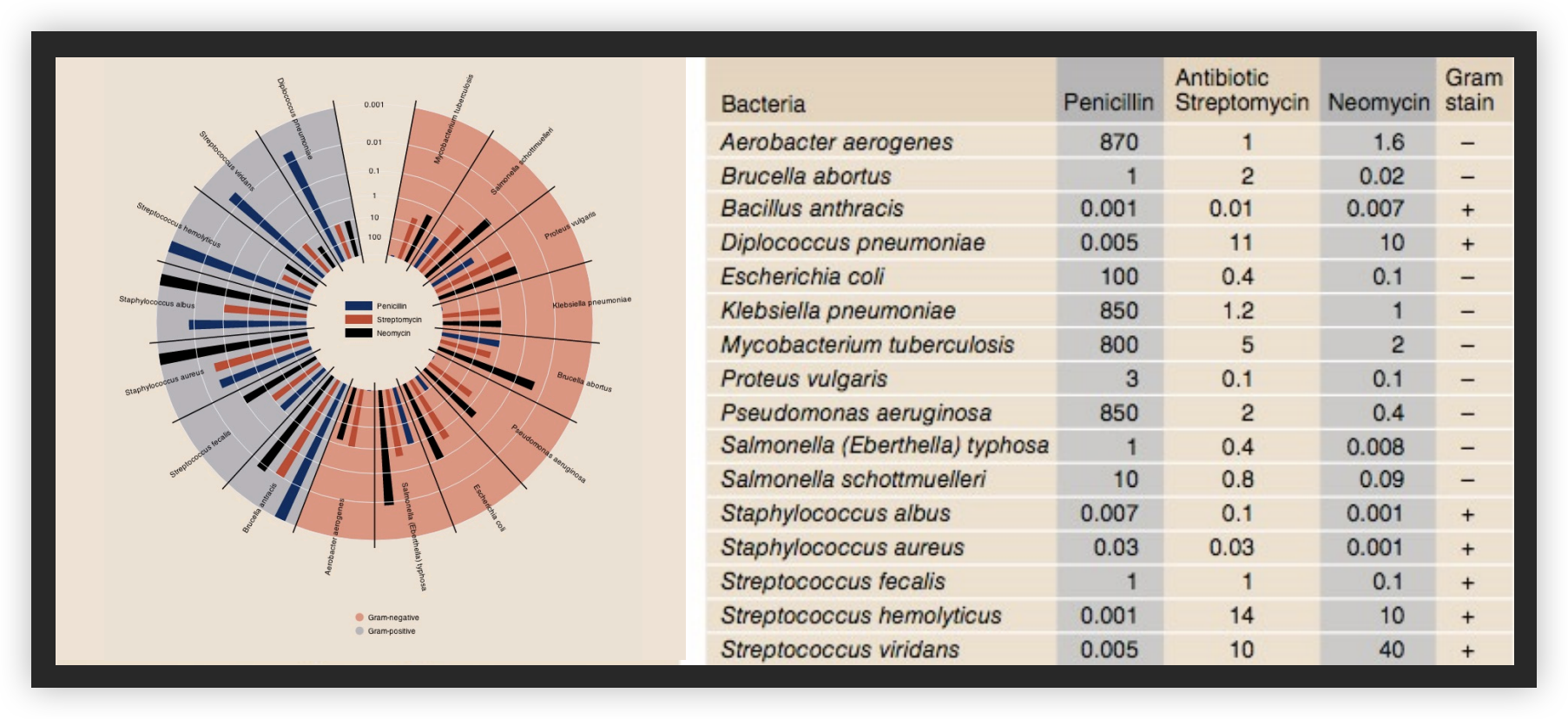
Analysis Example:Effectiveness of Antibiotics

Collected prior to 1951
Will Burtin, 1951
Radius: 1/log(MIC) Bar Color: Antibiotic Background Color: Gram Staining
Wainer & Lysen, American Scientist, 2009

Lessons Of Exploratory Process
- Construct graphics to address questions
- Inspect “answer”and assess new questions
- Repeat!
Transform the data appropriately (e.g., invert, log)
“Show data variation, not design variation”
-Tufte
Tableau/Polaris
- Exploratory analysis may combine graphical methods, and statistics
- Use questions to uncover more questions
- Interaction is essential for exploring large multidimensional datasets
Not my focus, so I skipped it.