Enhance Dataviz via ControlNet-Canny
TLDR This article explores how to enhance data visualization using ControlNet-Canny, inspired by historical Zoomorphic Maps. By leveraging AI tools like ComfyUI and ControlNet, we can infuse charts with thematic elements while preserving their data integrity, creating more engaging and contextually relevant visualizations. The experiment demonstrates a modern approach to an age-old cartographic technique of making data more expressive and meaningful through creative visual representation.

Zoomorphic Maps
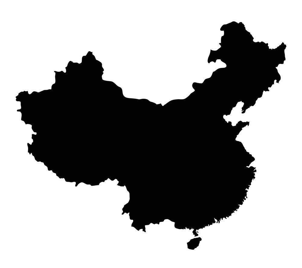
You might inadvertently discover that a certain area on the map closely resembles a real-world object, such as the popular meme on the internet:

In fact, there exists a special cartographic method known as Zoomorphic Maps. In the 16th to 17th centuries, cartographers commissioned by local leaders used this mapping technique to convey the symbolic significance of a particular region to the people. For instance, they might depict the inhabitants as untamed savages or brutal war initiators.
19th Century Zoomorphic Map of Europe
"In L'Europe Animale, Germany is a sly wolf waiting to pounce, while the Angling map personifies the nation with its militaristic ruler, Kaiser Wilhelm II, who is looking over the horizon. The great big Russian bear and Tsar Nicholas are pretty intimidating as well. The end result of all this animosity was of course World War I"
ControlNet-Canny
The aforementioned mapping technique is now a thing of the past, but it indeed offered valuable guidance in cartography. Specifically, it involved filling charts with particular content to achieve more effective expression in specific contexts.
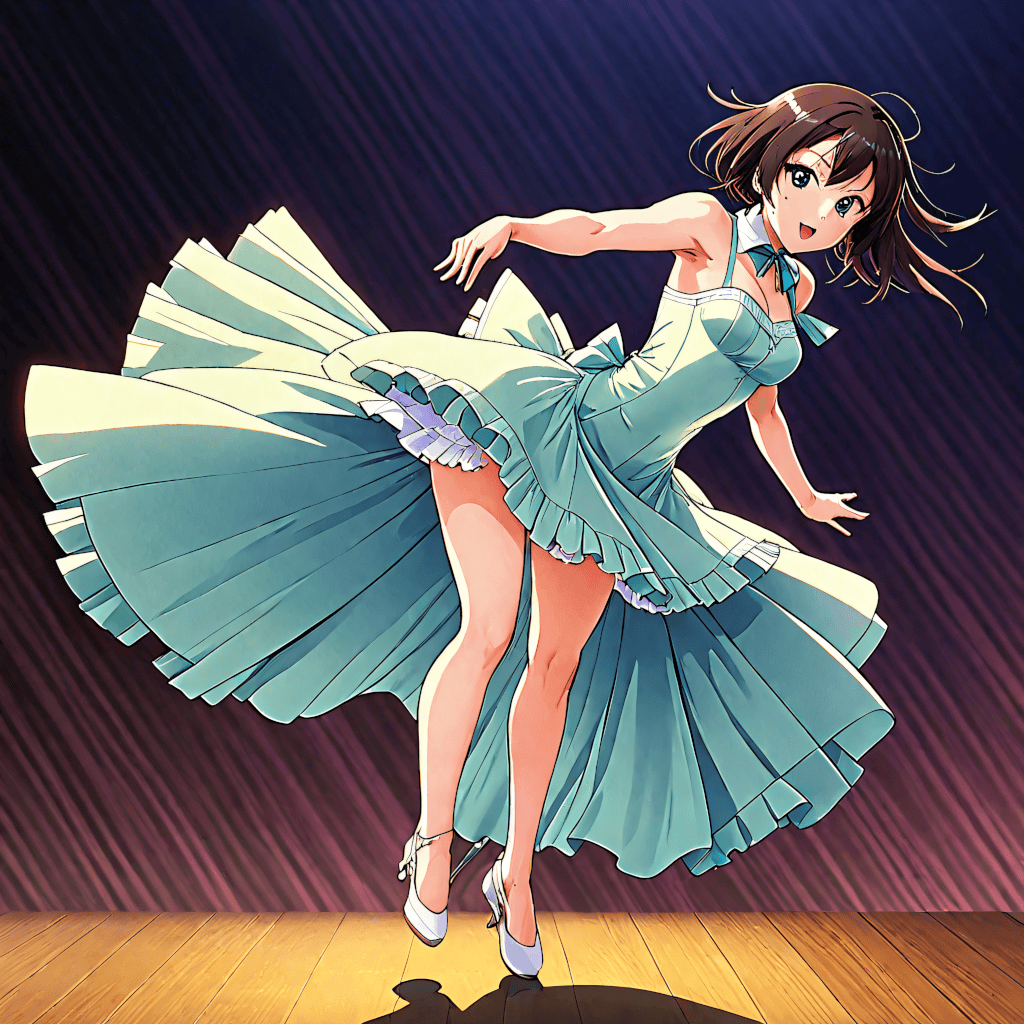
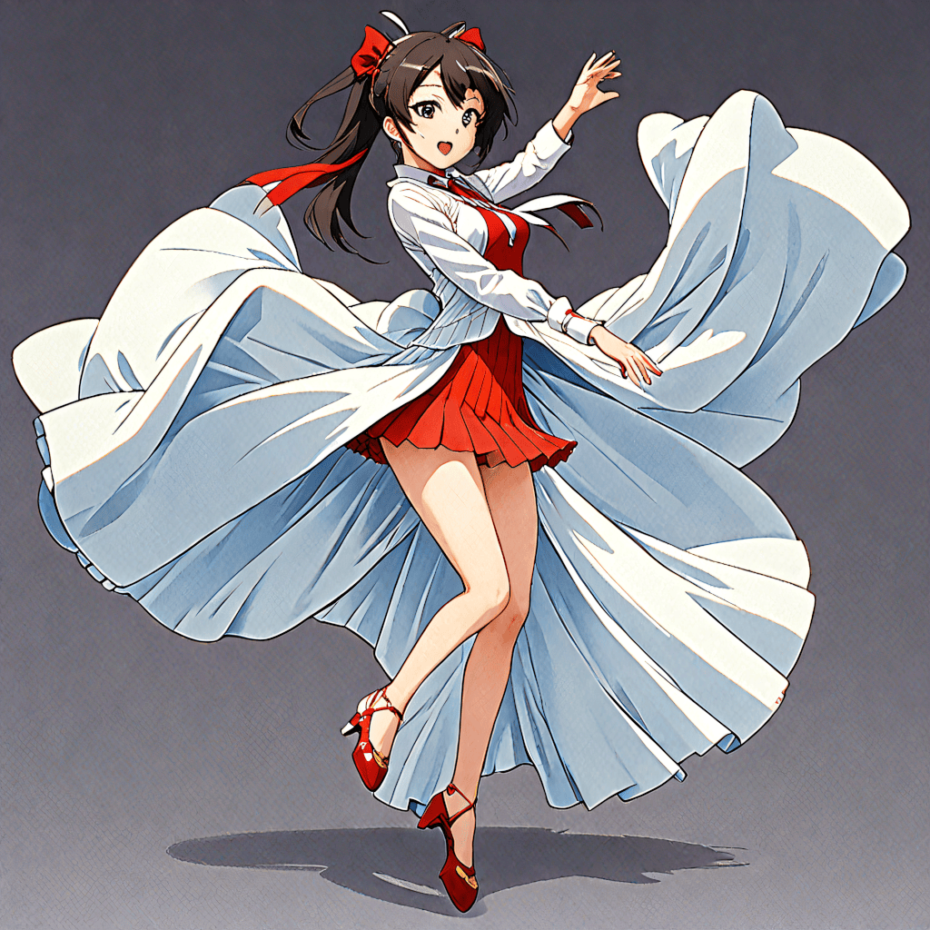
Having recently come across ComfyUI, I've been considering that perhaps using ControlNet could achieve this efficiently and cost-effectively. Let's start with something simple by giving a basic chart an environmental theme.
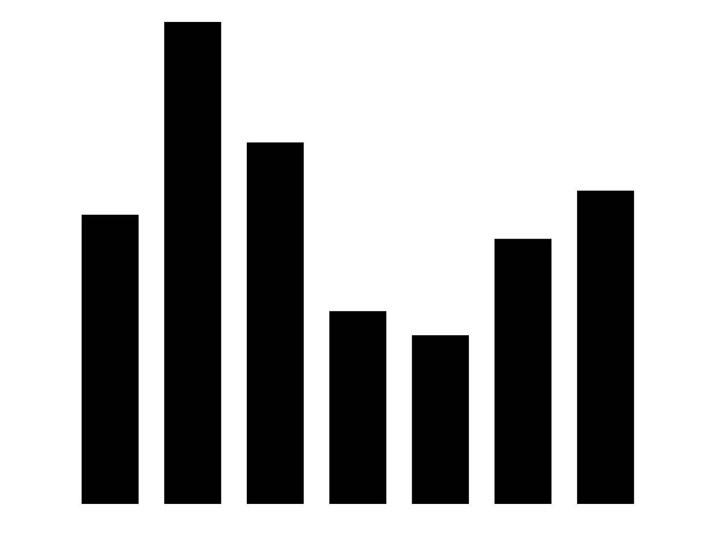


It can be observed that when working with clear visual geometric shapes, ControlNet is able to accurately preserve the characteristics of the shapes. Here, I have used a LoRA with a theme inspired by Hayao Miyazaki's animations to specialize the visual style. Some basic effects are already noticeable, although they are not yet exquisite. In fact, I have only used some simple prompts, such as forest, lake, and sky, without providing a complete creative description. Therefore, there is still room for improvement.
Now let us return to the topic of the Zoomorphic Map. You can easily sense that this is actually a very complex task. It involves drawing within a defined irregular shape where the content seamlessly matches the edges without distortion, all while conveying the intended emotional impact. Even for skilled designers, completing such a task in a short period is challenging. Currently, Stable Diffusion also cannot achieve this perfectly, but it might provide some foundational assistance.
Simply providing the map's outline and expecting a result is clearly unrealistic, as the current capabilities of Stable Diffusion do not support this. However, it might help to visualize some of your creative ideas. For example, you could provide a simple sketch, generate content from it, then create a more detailed outline based on the generated content, and continue generating content iteratively. Through this spiraling, iterative improvement method, it might be possible to achieve satisfactory results.
Try
After a brief attempt, the following results were achieved. Although there are still many details that need improvement, the outline has already met my expectations.