Stanford CS448B 05 Space2D
TLDR
This article contains my notes from Stanford's CS448B (Data Visualization) course, specifically focusing on the fifth lecture about space in 2D. I'll discuss the importance of space in data visualization, the principles behind it, and explore various techniques for visualizing data, including the use of guides, expressiveness, effectiveness, support for comparison and pattern perception, grouping and sorting data, transforming data, reducing cognitive overhead, and consistency. I'll also cover various chart types, such as line charts, bar charts, stacked area charts, and others, providing examples and discussing their design considerations.
Original
Notes
Forward-Thinking
- How do we know which type of visualization to use? Are there some general principals that lead us to choose a bar chart over a pie chart? What is the psychology of different mark types and visual encodings?
- Is there a standard/scientific method of sorts by which graphic designers are supposed to explore, iterate, and finalize their designs?
- In reference to the social network graph from Wednesday lecture with the node-link, linkage-sorted matrix, and non-sorted matrix views, "Are there other algorithms that can help bring out specific patterns in your data?”
- In reference to public (Twitter) vs. private (academic) data visualization critiques and how people have paid more attention to data visualizations during the COVID-19 pandemic: "Do readers’ goals align with designers’ goals and if they don’t how does that impact the insights that users walk away with as well as the redesign process?
Is it fair to leave it solely up to the experts? Furthermore, how do author communicate their goals to users?

Graph And Lines
File space
Show data with as much resolution as possible
Don’t worry about showing zero

Include zero in the axis scale?
Axis tick mark selection
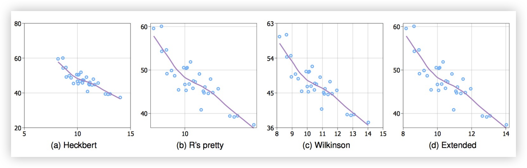
- Simplicity - numbers are multiples of 10, 5, 2
- Coverage - ticks near the ends of the data
- Density - not too many, nor too few
- Legibility - whitespace, horizontal text, size
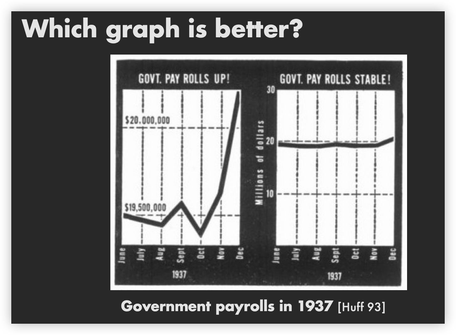
How to scale the axis?
Extreme value solutions
Original:

Solution1:Clip Outliers

Notice that the biggest outlier is not shown
In a real task, outliers maybe marked in other conspicuous ways.
Solution2:Clearly Mark Scale Breaks

Solution3:Logarithmic Scale

In my opinion, logarithmic scale is an option that needs to be chosen carefully to resolve the extreme value problem because it reduces the differences between data points, leading to a decreased sensitivity to the data for users.
Both increase visual resolution
- Log scale - easy comparisons of all data
- Scale break – more difficult to compare across break
Linear Scale vs. Log Scale
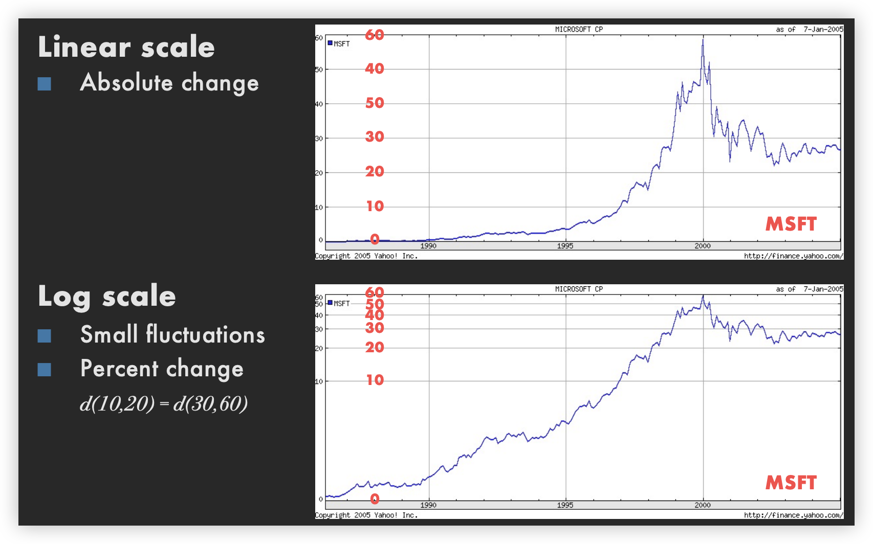
Log Scales
Logarithms turn multiplication into addition
log(xy) = log(x) + log(y)
Equal steps on a log scale correspond to equal changes to a multiplicative scale factor
When to apply log scales?
-
Address data skew (e.g., long tails, outliers)
-
Enables comparison across multiple orders of magnitude
-
Focus on multiplicative factors (not additive)
-
Recall that the logarithm transforms ×to + !
-
Percentage change, not linear difference.
-
Constraint: positive, non-zero values
-
Constraint: audience familiarity?
Semilog Graph
Exponential functions transform into lines
Intercept:
Slope:

, slope in semilog space:

, slope in semilog space:
Selecting Aspect Ratio
 Same data with different aspect ratios
Banking to 45°[Cleveland]
To facilitate perception of trends, maximize the discriminability of line segment orientations

Two line segments are maximally discriminable when the absolute angle between them is 45°
Method: Optimize the aspect ratio such that the average absolute angle between all segments is 45°
Minimize arc length (hold area constant)

Good Compromise


Arc-length banking produces aspect ratios in-between those produced by other methods.
Fitting Data


Transforming Data
How well does curve fit data?

Residual graph
- Plot vertical distance from best fit curve
- Residual graph shows accuracy of fit

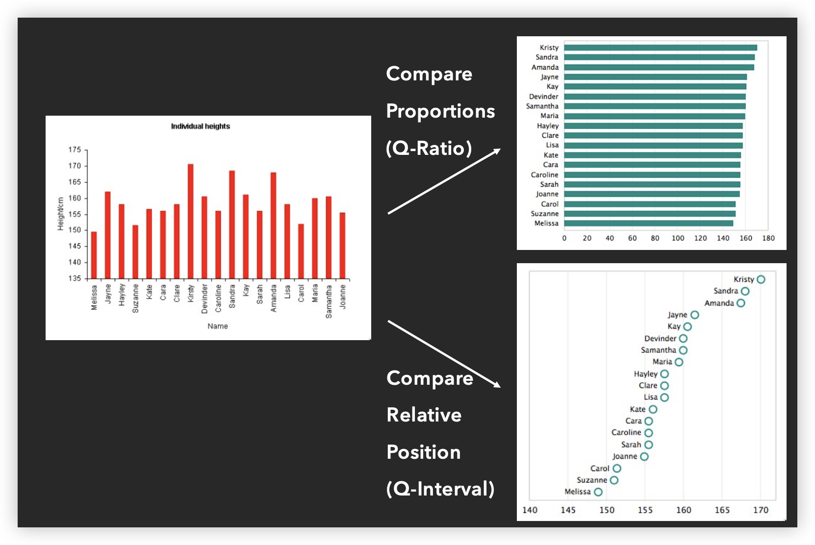
Sorting

Analyze the characteristics of the variables

Ordering

Result

Cartographic Distortion
Election 2016 map

The states are colored red or blue to indicate whether a majority of their voters voted for the Republican candidate, Donald Trump, or the Democratic candidate, Hillary Clinton, respectively. There is significantly more red on this map than blue, but that is misleading: the election was much closer than it seems from the colors, and Clinton actually won slightly more votes overall. The map fails to account for population distribution, with red states having a lower average population than blue ones. The blue states may be smaller in area, but they represent a larger number of voters, which is crucial in an election.
We can correct this by using a cartogram, a map where state sizes are rescaled according to their population. States are drawn with size proportional to their number of inhabitants, not their acreage. For example, Rhode Island, with 1.1 million people, would appear about twice the size of Wyoming, which has half a million, despite Wyoming having 60 times the acreage.
Here are the 2016 presidential election results on a population cartogram of this type:

However, this map is still somewhat misleading because we have colored every county either red or blue, as if every voter voted the same way. This is of course not realistic: all counties contain both Republican and Democratic supporters and in using just the two colors on our map we lose any information about the balance between them. There is no way to tell whether a particular county went strongly for one candidate or the other or whether it was relatively evenly split.
One way to reveal more nuance in the vote is to use not just two colors, red and blue, but to use red, blue, and shades of purple in between to indicate percentages of votes. Here is what the normal map looks like if you do this:

- Statistical map with shading

- Framed rectangle chart

- Distort areas

- Rectangular cartogram

- NYT Election 2004


- Dorling cartogram

- Distorting distances

- London underground

- LineDrive [Agrawala & Stolte 2001]


Summary
- Space is the most important visual encoding
- Show data with as much resolution as possible
- Geometric properties of spatial transforms support geometric reasoning
- Use distortions to emphasize important information