Paper Reading TimeOntheHorzon
· 2 min read
TLDR
This article contains my notes from the paper "Time on the Horizon: A New Visual Design for Time-Series Data". I'll discuss the problem statement, the evaluation criteria, the authors' approach, and the case study.

Paper
Notes
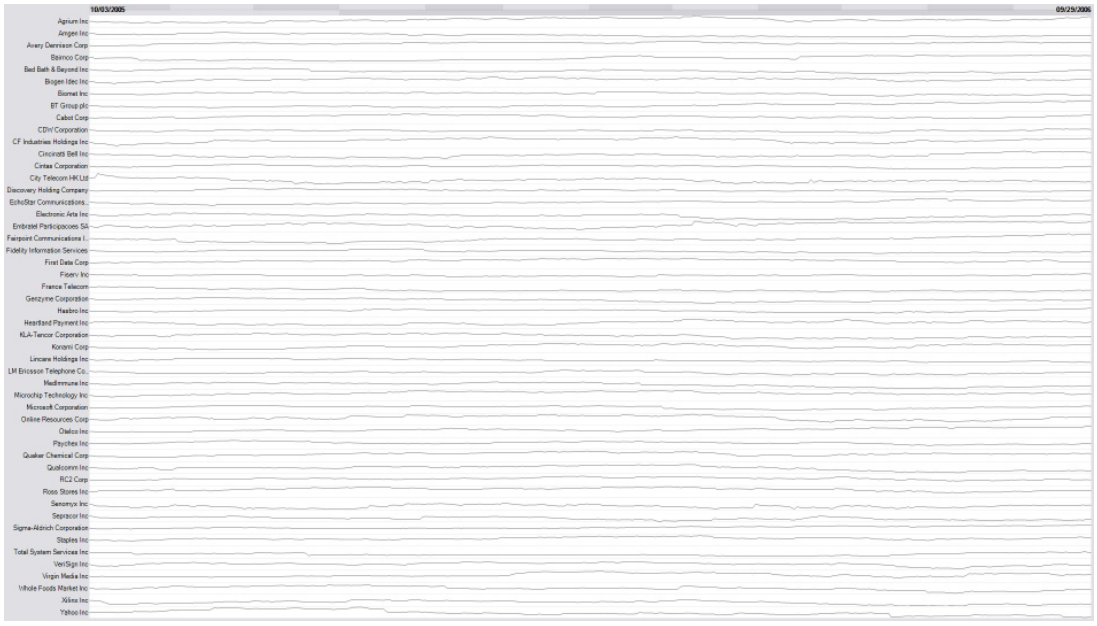
This paper presents an excellent visual design: Horizon graph. This design solves the problem that the aspect ratio of single dimension is too high when multiple single dimension flow graphs are displayed side by side.
Approach:
- Use a conspicuous ladder color split the value
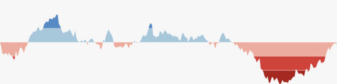
- Positive and negative values share vertical space(1/2 height saved)
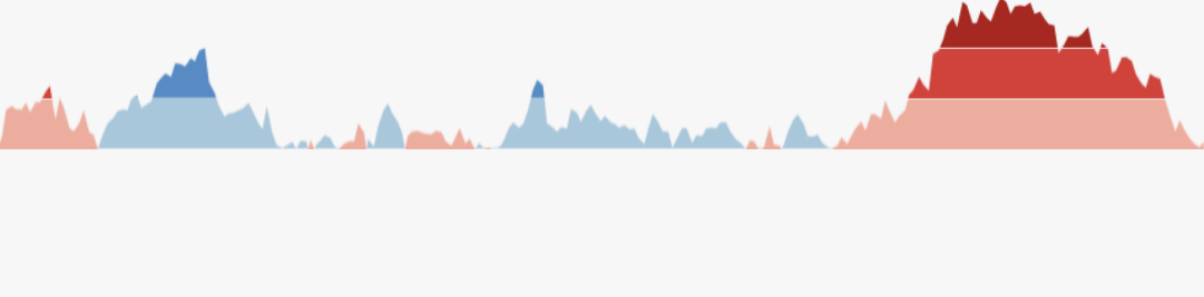
- Collapse the color bands (1/3 height saved)
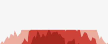
total use 1/6 height of original