Stanford CS448B 06 Interaction
TLDR
This article contains my notes from Stanford's CS448B (Data Visualization) course, specifically focusing on the sixth lecture about interaction. I'll discuss the importance of interaction in data visualization, the principles behind it, and explore various techniques for visualizing data, including the use of guides, expressiveness, effectiveness, support for comparison and pattern perception, grouping and sorting data, transforming data, reducing cognitive overhead, and consistency. I'll also cover various chart types, such as line charts, bar charts, stacked area charts, and others, providing examples and discussing their design considerations.

Original
Notes
Forward Thinking
- How do you balance details with overarching views? How to decide when there is too much vs. too little data in a view?
- In the VDQI reading, it was stated that we can increase data density in two ways: increasing the number of data points or decreasing the size of the graph... When it is advisable to reduce the size of our graph to increase the density? ... Are there any quantitative metrics to assess visualization interpretability?
- From an accessibility standpoint, I wonder if there are ways to facilitate micro-macro reading through haptic and audio means?
- And more generally, what are instances where poor design choices on the micro level can obscure the types of insights gained at the macro level?
- When is it appropriate to exclude outlying data points? For datasets of the Challenger launch tests, the outliers were everything. All data is prone to some degree of variation, so how much significance should we place on outliers?
Interaction between people and machines requires mutual intelligibility or shared understanding
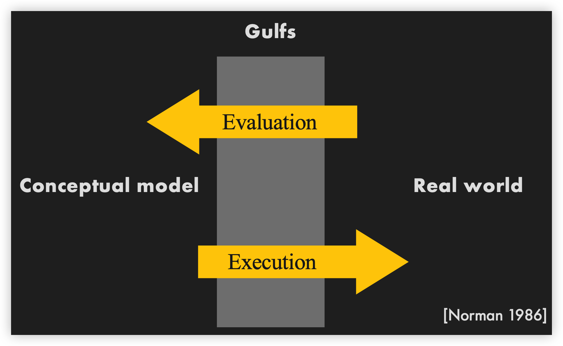
Gulf of evaluation
The difference between the user’s intentions and the allowable actions.


Gulf of execution
The amount of effort that the person must exert to interpret the state of the system and to determine how well the expectations and intentions have been met.


Early Systems


Group similar rows and columns:
- Choose a row with a particular visual aspect. Move to extremity of matrix
- Move similar rows close, opposite rows to bottom. (Creates two opposing groups and a middle group)
- Repeat for columns (only in some cases)
- Iterate


Pointing


 Voronoi diagram
Highlighting
Focus user attention on a subset of the data within one graph [from Wills 95]

Brushing and Linking
Select (“brush”) a subset of data
See selected data in other views
The views must be linked by tuple (matching data points), or by query (matching range or values)

Baseball statistics
CrossFiltering

Dynamic Queries

3D Dynamic Queries


Pros And Cons
Pros
- Controls useful for both novices and experts
- Quick way to explore data
Cons
- Simple queries
- Lots of controls
- Amount of data shown limited by screen space
Summary
Good visualizations are task dependent
Pick the right interaction technique
Fundamental interaction techniques
Selection, Brushing & Linking, Dynamic Queries