
30 posts tagged with "Dataviz"

View All Tags

Eyes Tracking

· 5 min read

TLDR

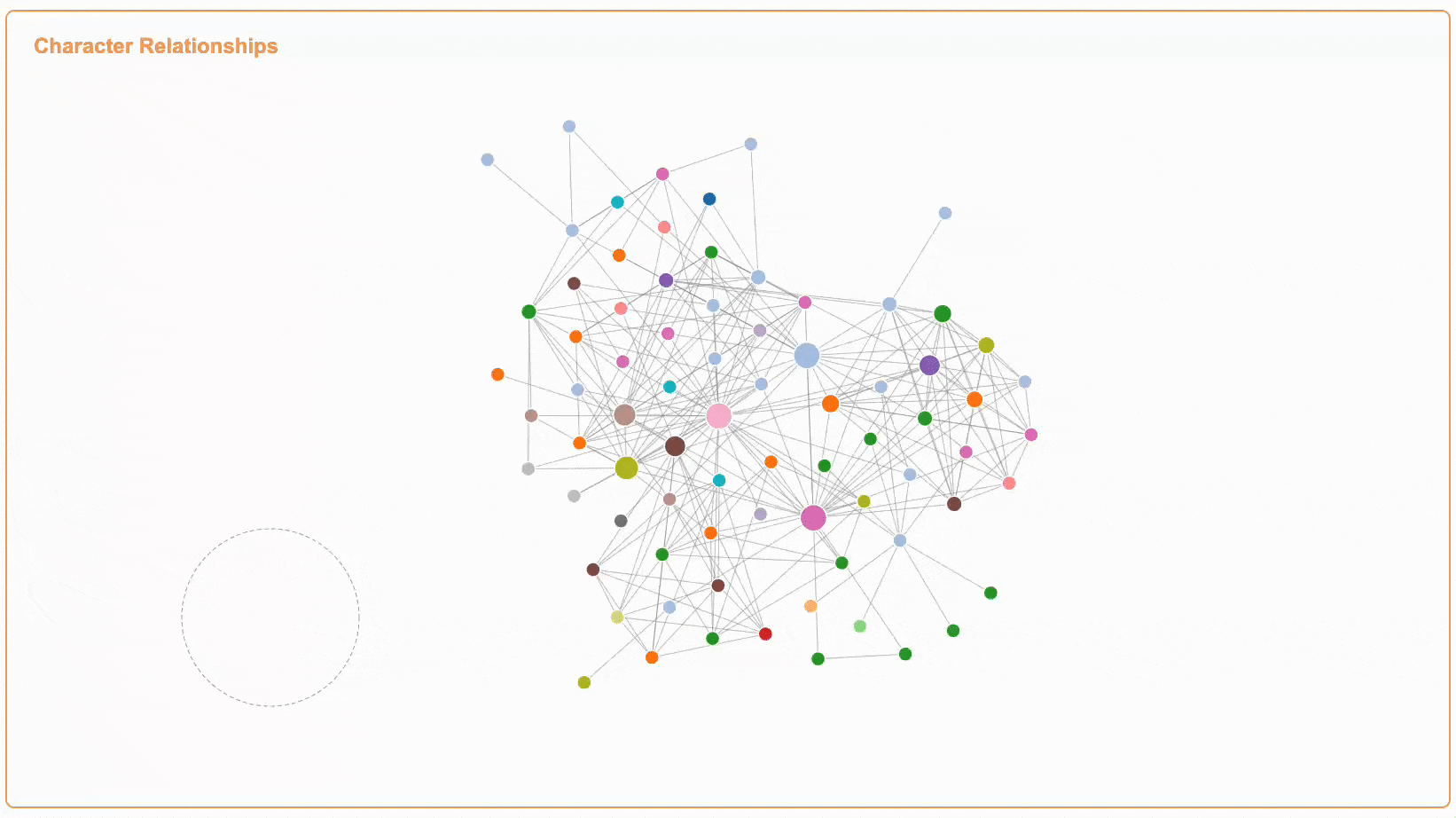
This article explores a new interaction method for complex network visualizations that combines fisheye distortion with eye tracking technology. The approach allows users to naturally explore dense node-link diagrams by controlling the fisheye effect with their gaze, while keeping the mouse available for other interactions. This is particularly useful for organizational relationship visualizations where users need to switch between overview and detailed views of specific connections.

eyesTrack

Enhance Dataviz via ControlNet-Canny

· 4 min read

TLDR This article explores how to enhance data visualization using ControlNet-Canny, inspired by historical Zoomorphic Maps. By leveraging AI tools like ComfyUI and ControlNet, we can infuse charts with thematic elements while preserving their data integrity, creating more engaging and contextually relevant visualizations. The experiment demonstrates a modern approach to an age-old cartographic technique of making data more expressive and meaningful through creative visual representation.

Pixelated Art

· 14 min read

TLDR This article documents my experimental attempt at creating pixel art animations using AI tools. Through exploring different approaches like ComfyUI, I tried to generate character sprite sheets for a simple running animation. While the results are still preliminary and face several challenges, this experiment provides some insights into combining AI with pixel art creation. The article shares my learning process and the technical workflow I developed, hoping it might be helpful for others interested in similar experiments.

Paper Reading Automation Shape the Process of Narrative Visualization

· 9 min read

TLDR

The study investigates the involvement of automation in narrative visualization tools, summarizing six genres: annotated charts, infographics, timelines & storylines, data comics, scrollytelling & slideshow, and data videos. It categorizes four types of tools:design spaces, authoring tools, ML/AI-supported tools, and ML/AI-generator tools according to their intelligence and automation levels. By surveying 105 papers and tools, the study explores how automation can progressively engage in visualization design and narrative processes to aid users in creating narrative visualizations. It aims to provide an overview of current research and development, identifies key research problems in each category, and suggests opportunities for further investigation in this domain.

ECharts Morph Transition

· 15 min read

TLDR

This article explores how ECharts implements morphing transitions between different shapes. We'll examine the core implementation in the source code, breaking down the process into key steps including path conversion, structure alignment, and optimal rotation calculation. Through this analysis, we'll understand how ECharts achieves smooth shape transformations while maintaining visual continuity.

Extending ECharts Global Roaming

· 12 min read

TLDR

This article explores how to extend ECharts' global roaming functionality. While ECharts provides roaming through dataZoom for Cartesian charts, relationship-type charts lack full global roaming support. We'll examine ECharts' current single-series roaming implementation and develop a solution to enable global roaming across all chart types.

Paper Reading LIDA

· 7 min read

TLDR

LIDA is a novel tool for generating grammar-agnostic visualizations and infographics. It addresses several key challenges in automatic visualization creation:

  1. Understanding data semantics
  2. Enumerating visualization goals
  3. Generating visualization specifications

The system uses a multi-stage pipeline powered by large language models (LLMs) and image generation models (IGMs). It consists of 4 main modules:

  1. SUMMARIZER: Converts data into compact natural language summaries
  2. GOAL EXPLORER: Identifies potential visualization goals based on the data
  3. VISGENERATOR: Handles visualization code generation, refinement and filtering
  4. INFOGRAPHER: Creates data-driven stylized graphics using IGMs

LIDA provides both a Python API and an interactive user interface supporting direct manipulation and multilingual natural language for generating charts, infographics and data stories.

ECharts Overview

· 9 min read

TLDR

In the past two years, my work has involved building chart components based on ECharts. This experience has given me a fundamental understanding of visualization component libraries. This article primarily introduces ECharts from the perspectives of timeline, feature and architecture.

Paper Reading DMap

· 3 min read

TLDR

This article contains my notes from the paper "D-Map: Visual Analysis of Ego-centric Information Diffusion Patterns in Social Media". I'll discuss how the paper proposes a visualization method to analyze information propagation patterns on social media platforms, with a focus on the D-Map layout algorithm that transforms force-directed graphs into honeycomb diagrams.

Color Space

· 7 min read

TLDR

This article explores the concept of color spaces, their diversity, and characteristics. It delves into the foundational CIE 1931 color space, which serves as the reference standard for all other color spaces. Through interactive visualizations and video explanations, we'll examine how different color spaces are defined and their practical implications in color representation and reproduction.

Paper Reading TimeOntheHorzon

· One min read

TLDR

This article contains my notes from the paper "Time on the Horizon: A New Visual Design for Time-Series Data". I'll discuss the problem statement, the evaluation criteria, the authors' approach, and the case study.

Paper Reading SineStream

· 6 min read

TLDR

This article contains my notes from the paper "SineStream: Improving the Readability of Streamgraphs by Minimizing Sine Illusion Effects". I'll discuss the problem statement, the evaluation criteria, the authors' approach, and the case study.

Stanford CS448B 18 TextVis

· 6 min read

TLDR

This article contains my notes from Stanford's CS448B (Data Visualization) course, specifically focusing on the eighteenth lecture about text visualization. I'll discuss the importance of documents, collections of documents, and the different types of visualizations for text data.

Stanford CS448B 17 VisML

· 4 min read

TLDR

This article contains my notes from Stanford's CS448B (Data Visualization) course, specifically focusing on the seventeenth lecture about visualization and machine learning. I'll discuss the importance of understanding data, model training, model evaluation, and the different types of visualizations for machine learning tasks.

Stanford CS448B 16 VisNLP

· 2 min read

TLDR

This article contains my notes from Stanford's CS448B (Data Visualization) course, specifically focusing on the sixteenth lecture about visualization and natural language processing. I'll discuss the importance of linking text with visualization, understanding how readers integrate charts and captions, visual question and answering, and natural language interfaces.

Stanford CS448B 14 Network Analysis

· 4 min read

TLDR

This article contains my notes from Stanford's CS448B (Data Visualization) course, specifically focusing on the fourteenth lecture about network analysis. I'll discuss the importance of centrality, community structure, and simulating network models.

Stanford CS448B 13 Network Layout

· 7 min read

TLDR

This article contains my notes from Stanford's CS448B (Data Visualization) course, specifically focusing on the thirteenth lecture about network layout. I'll discuss the importance of tree layout, node-link graph layout, spanning tree layout, Sugiyama-style graph layout, hierarchical edge bundles, force-directed layout, alternative layouts, attribute-driven layout, and summary.

Stanford CS448B 12 Animation

· 6 min read

TLDR

This article contains my notes from Stanford's CS448B (Data Visualization) course, specifically focusing on the twelfth lecture about animation. I'll discuss the importance of animation in data visualization, the principles behind it, and explore various techniques for visualizing data, including the use of guides, expressiveness, effectiveness, support for comparison and pattern perception, grouping and sorting data, transforming data, reducing cognitive overhead, and consistency. I'll also cover various chart types, such as line charts, bar charts, stacked area charts, and others, providing examples and discussing their design considerations.