Color Review
TLDR Starting from human perception, this post systematically unpacks the physical and physiological basis of “color”: visible-light spectrum, the L/M/S cone cells in the retina, and the separation of luminance and chroma, so readers can see why three dimensions suffice to describe color. It then covers metamerism and the difference between additive and subtractive mixing, clarifying how displays (emitted light) and print (pigment) impose different constraints in practice, and how the continuous spectrum is geometricized into a color wheel to support intuitive picking and palette strategies. On color spaces, it contrasts perception-oriented CIE-family spaces with implementation-oriented RGB-family spaces and the problems each solves. Finally it introduces a perception-friendly workspace, HCT, and how it delivers more natural gradients, more consistent palettes, and better alignment with accessibility standards in front-end and visualization work.
How humans perceive color
A minimal background on light and vision
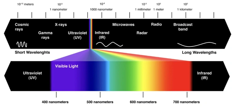
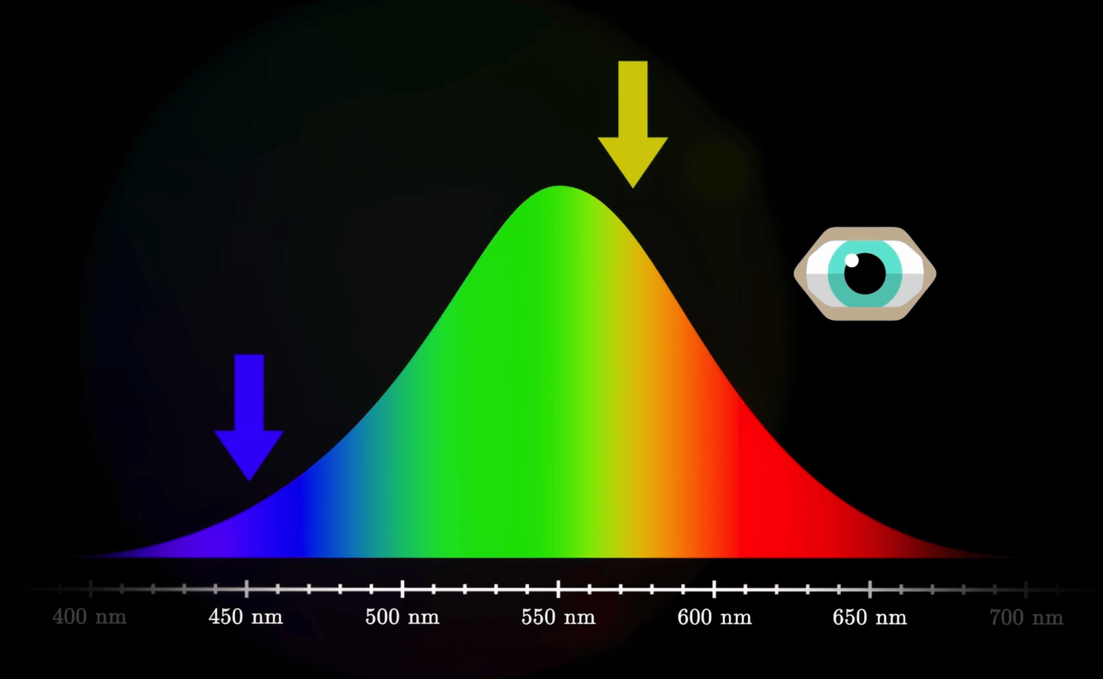
- Visible light is just a tiny slice of the electromagnetic spectrum, with wavelengths roughly between 400–700 nm.
- A beam of light can be thought of as a mixture of energy at different wavelengths, i.e. its spectral power distribution.
- Objects do not “carry” color by themselves. Under a given illuminant, they absorb some wavelength bands and reflect/transmit the rest, forming an incoming spectrum at the eye; the eye’s response to this spectrum is then interpreted by the brain as a particular color.
In engineering practice, we usually do not manipulate the full spectrum as a continuous function. Instead, we approximate the eye’s response with three numbers (for example sRGB or CIE XYZ).
Retina and the three cone types (L/M/S)
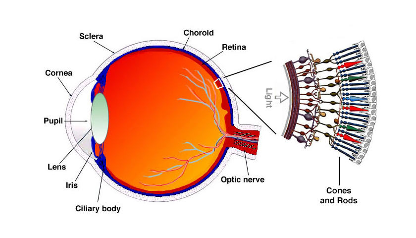
Human color vision mainly relies on two types of photoreceptors on the retina:
- Rod cells: work under low light (scotopic vision), are only sensitive to lightness and almost ignore chromatic differences.
- Cone cells: work under daylight/bright conditions (photopic vision) and come in three types:
- L cones: more sensitive to longer wavelengths (reddish)
- M cones: more sensitive to middle wavelengths (greenish)
- S cones: more sensitive to shorter wavelengths (bluish)
Each cone type has its own “sensitivity curve” over wavelength. These three curves are broad and heavily overlapping.
When a beam of light enters the eye, it produces a triplet of responses on the L/M/S channels, .
This 3‑tuple forms the basic input on which the brain performs its color computations.
This is the trichromatic theory: for a normal observer, three dimensions are enough to describe color, because the eye effectively only has three independent chromatic channels.
Lightness and chromaticity: how the brain turns three channels into “color”

From L/M/S responses to the subjective impression of lightness + hue + saturation, there is a complex cascade of neural processing. Common high‑level abstractions include:
- Lightness / Luminance: roughly tied to the overall L/M cone response and contrast against the surroundings.
- Chromaticity: after factoring out overall lightness, the remaining information determines “which color it is”:
- Hue: whether it looks red vs green, yellow vs blue; it relates to relative strengths across the channels.
- Saturation / Chroma: how vivid or dull the color looks; it relates to how far the signal is from “no color” (gray).
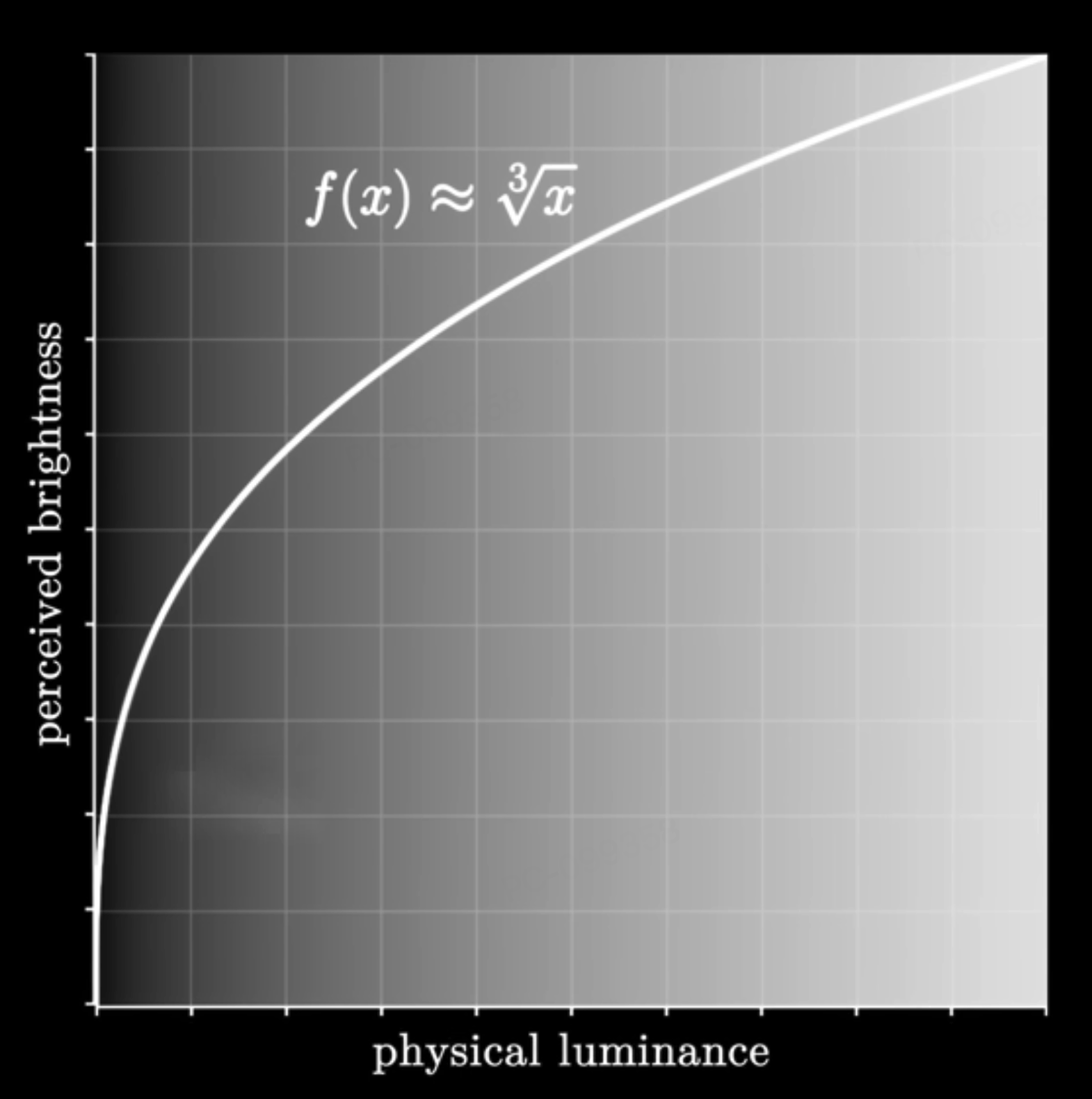
Psychophysical experiments show that:
- The eye is more sensitive to changes in lightness than to the same‑magnitude changes in chroma, especially in dark regions.
- Sensitivity also depends on hue: we are most sensitive around greenish hues, and less so at extreme blues or reds.
- These empirical facts are foundational for later CIE color spaces and perceptually uniform spaces such as CIELAB or CAM16.
Short‑wavelength blue light has higher physical energy. It is more likely to cause photochemical damage on the retina, and it scatters more, contributing to glare. Physiologically, blue light strongly stimulates melanopsin‑containing cells involved in circadian rhythms; heavy blue exposure at night “tricks” the brain into thinking it is daytime, suppressing melatonin and perturbing sleep. “Blue‑light reduction modes” are essentially cutting short‑wave energy and shifting the overall white point warmer.
The “eye‑comfort / night mode” on phones and computers does exactly this: attenuate blue and shift the display towards yellow. You can compare your device’s normal and night modes to feel the change in color temperature.
The eye’s luminous efficiency is high near green, and for a given physical luminance, greenish light tends to feel less glaring. A light greenish background with dark gray/ink text is therefore more comfortable for long‑form reading than pure white. With the limited contrast achievable on e‑ink, a slightly warm, slightly greenish paper tone is often a good compromise between legibility and comfort.
The “eye‑care green” themes in many reading apps, and the default background tone on e‑ink readers like Kindle, are everyday applications of this principle.
Metamerism and modes of color mixing
Metamerism: different spectra, same color
As noted earlier, the eye ultimately “decides” what color it sees based only on the three L/M/S responses .
This leads to an unintuitive phenomenon: metamerism.
- Two lights can have completely different spectral power distributions (different energy across wavelengths),
- yet produce almost identical responses in the three channels,
- so the eye perceives them as the same color.
An intuition:
The spectrum is in essence a high‑dimensional function, while the eye has only 3 independent channels. You can think of it as projecting a high‑dimensional signal down to 3D.
In this projection, it is easy for “different original signals” to land on the same 3D coordinate. Those pairs are metamers.

Typical examples:
- Display vs printer
- A display pixel emits light from R/G/B sub‑pixels; this is additive mixing of light.
- A printer uses CMYK ink to absorb certain wavelengths from the illuminant and reflect the rest; this is subtractive mixing.
- The resulting spectra are very different, but under a given light source they can yield the same L/M/S responses, so they look “the same color” to the eye.
- Apparel under different illuminants
- The same garment reflects different spectra under warm indoor lighting vs outdoor daylight.
- Two garments might match under one illuminant but clearly differ under another—this is metamerism “breaking” when the light source changes.
Metamerism reminds us:
You cannot treat a device’s RGB values as “the one true color”.
To describe and convert colors in a device‑agnostic way, we must use models such as CIE XYZ, CIELAB, CAM16, which are based on an average human observer.
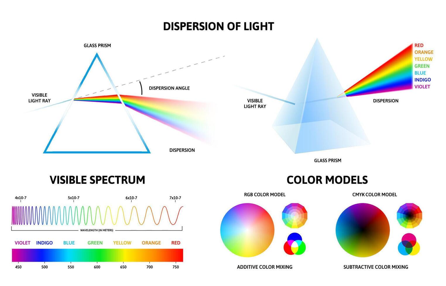
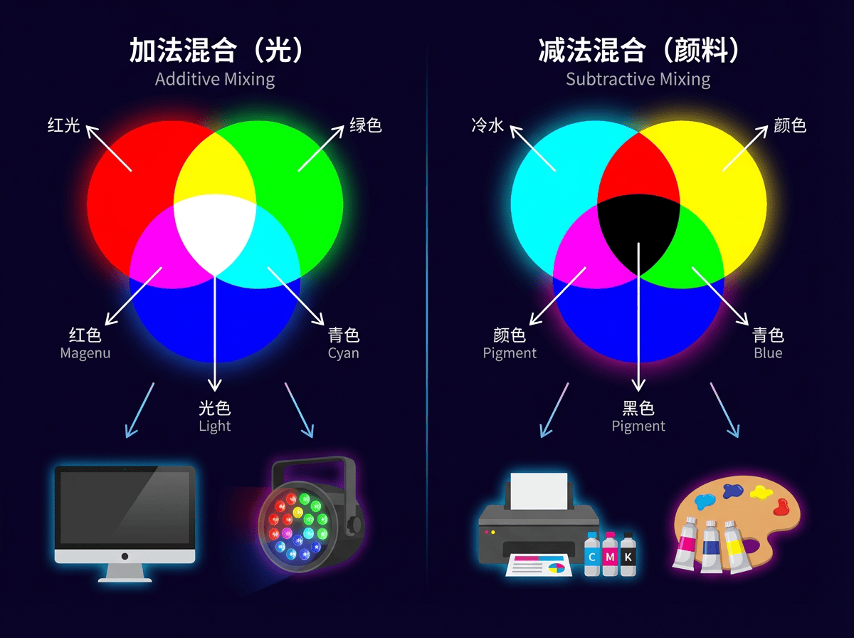
Additive mixing (RGB): stacking light from black to bright
Additive mixing means that on a completely dark background we add more light; brightness can only increase. Typical scenarios:
- R/G/B sub‑pixels on computer and phone displays
- Stage lighting and projectors casting colored light on a dark background
In an idealized RGB model:
- Increasing each channel’s numeric value increases the emitted radiant power in that band.
- Different colored lights add in the spectrum; to the eye, this moves perception from black → saturated colors → white.
Everyday examples:
- On a display, pure red (R=255, G=0, B=0) plus pure green (R=0, G=255, B=0) yields a yellowish color.
- Setting R/G/B all to their maxima (R=G=B=255) produces something close to white, because all three channels are strongly stimulated, approximating “high energy across the whole band”.
For front‑end and data visualization work, every on‑screen color can be thought of as the additive mixture of three primary lights (R/G/B).
This is why all web color specifications (e.g. sRGB) are built on RGB channels.
Subtractive mixing (CMY/RYB): stacking pigment from white to dark
Subtractive mixing is the opposite:
We start from “as much light as possible” — usually white light on white paper or canvas.
Pigments, inks and filters remove parts of this white light, only allowing some wavelengths to be reflected or transmitted.
Typical scenarios:
- Printing (CMYK printers, magazine covers)
- Pigment‑based painting: watercolor, acrylics, oils
- Colored filters (e.g. putting a blue filter in front of a white stage light)
Everyday examples:
- On white paper, first lay down a yellow wash, then a blue wash:
- Yellow pigment primarily absorbs blue–violet, reflecting red and green.
- Blue pigment primarily absorbs red–orange, reflecting blue and green.
- Combined, only a narrow greenish band is “let through” by both, so the paper looks green.
- In printing, the more cyan/magenta/yellow ink you stack, the less light the paper can reflect, so it appears darker and muddier; in the limit it approaches black.
You can roughly summarize the two modes as:
- Additive mixing: start from 0 and add upwards; more light → brighter, RGB closer to (1, 1, 1) → whiter.
- Subtractive mixing: start from 1 and subtract downwards; more absorption → darker, less reflected light → closer to black.
Understanding metamerism and additive vs subtractive mixing helps us keep straight, in engineering practice:
- The “color of light” on screens vs the “color of pigment” on paper are fundamentally different physical processes.
- The same perceived color may correspond to different spectra and device behaviors, which is why we need to map everything into standard CIE spaces and then do cross‑device color management.
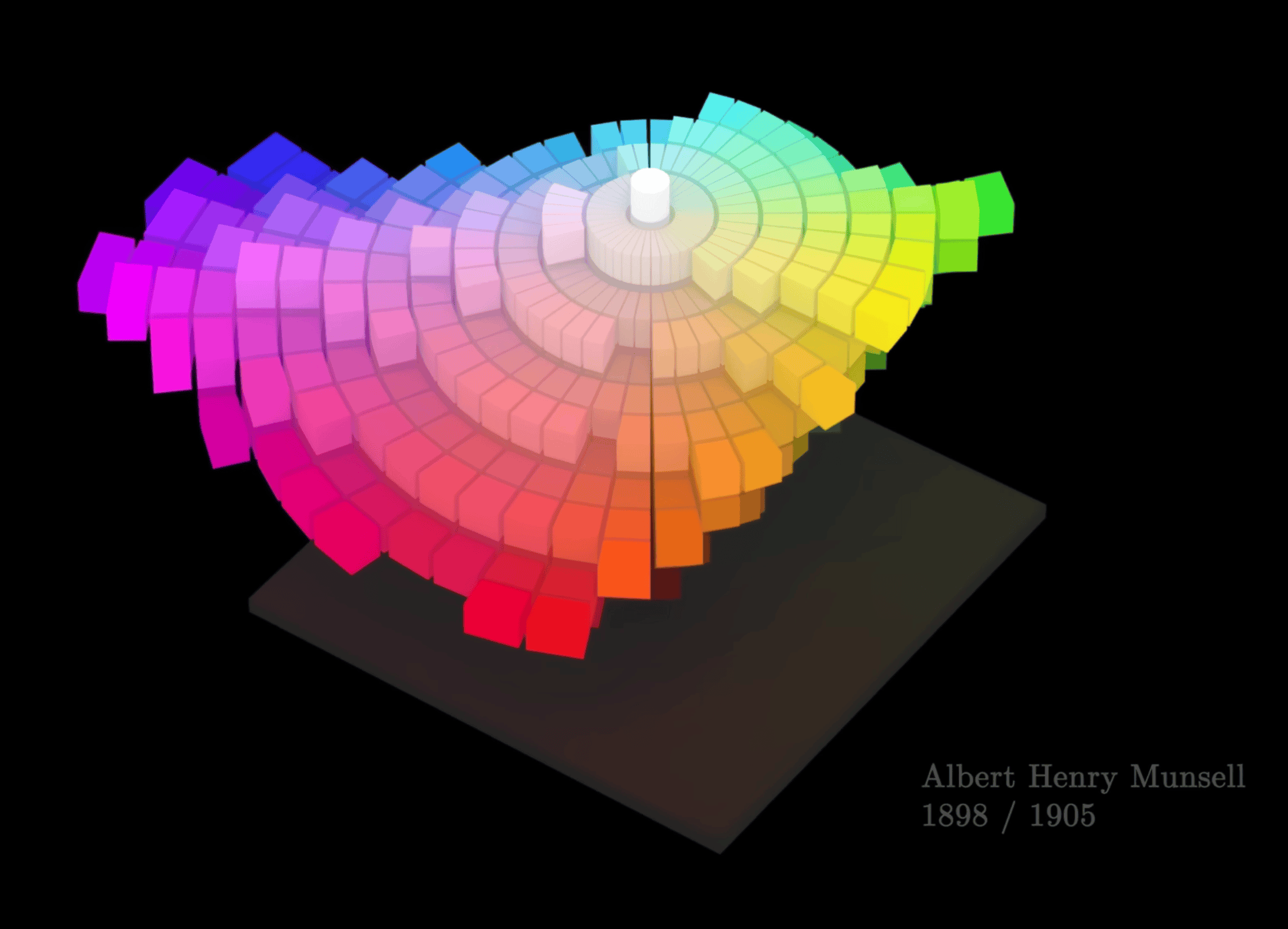
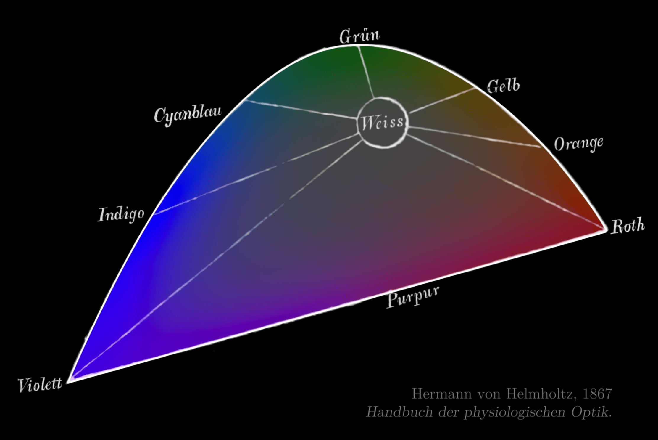
From spectra to the color wheel: geometrizing color
Spectral vs non‑spectral colors: why do we bend it into a wheel?
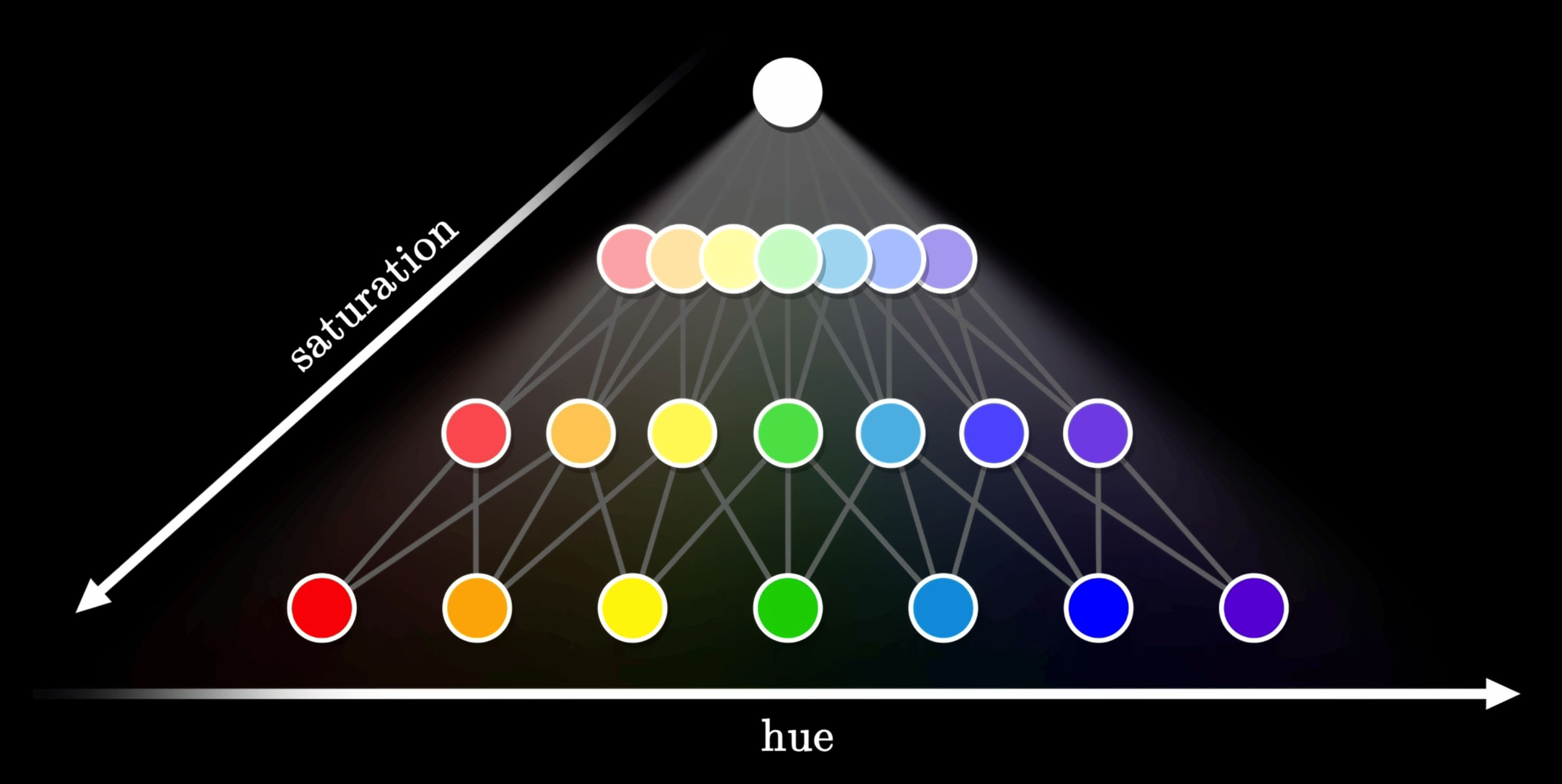
The prism experiment splits white light into a continuous spectrum, which is physically a line laid out by wavelength. But purples and magentas are non‑spectral colors that cannot be produced by a single wavelength; they require mixtures of long and short wavelengths. To geometrically accommodate such colors, we “wrap” the two ends of the spectrum together into a closed color wheel.
Color‑wheel layout and opponent‑color theory
Opponent‑color theory (red vs green, yellow vs blue) guides the rough arrangement of hues around the wheel. The color wheel is therefore not just a “wavelength‑in‑order” diagram; it encodes the structure of opponent channels in human vision and underpins all the “go around a circle to pick a hue” models (HSL, HCT, etc.).
Color‑selection strategies based on the color wheel

Early color‑wheel designs that attempted to equalize perceived strength around the circle still failed to make some opposite pairs mix to a neutral gray.
On the color wheel you can define analogous (adjacent), complementary (opposite), triadic/tetradic (equally spaced) schemes and other basic strategies. Adding lightness and saturation axes to the hue wheel yields an intuitive 3D “control surface” for choosing colors.
The familiar “circular hue wheel + vertical lightness bar” UI in design tools and front‑end color pickers is a direct implementation of this “hue wheel + lightness/saturation” structure.
Typical color spaces: the CIE family and RGB family
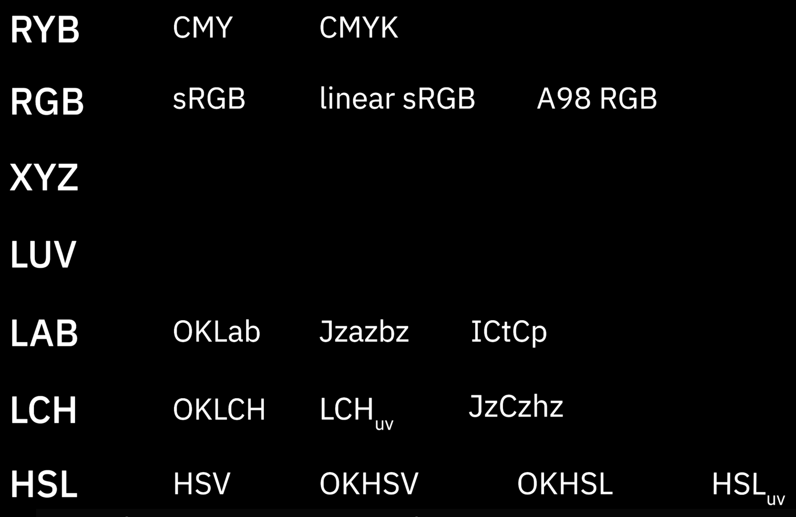
The CIE family starts from human perception, building device‑independent, approximately perceptually uniform coordinate systems to measure color differences and describe “what a human sees”.
The RGB family starts from industrial reproduction and encoding, defining how specific devices (displays, printers, cameras) emit light or render color and how to store color data. It solves “how to physically produce or encode a given color in the real world”, without guaranteeing perceptual uniformity.
CIE: modeling human perception
CIE 1931 XYZ / xyY: a device‑independent tristimulus baseline
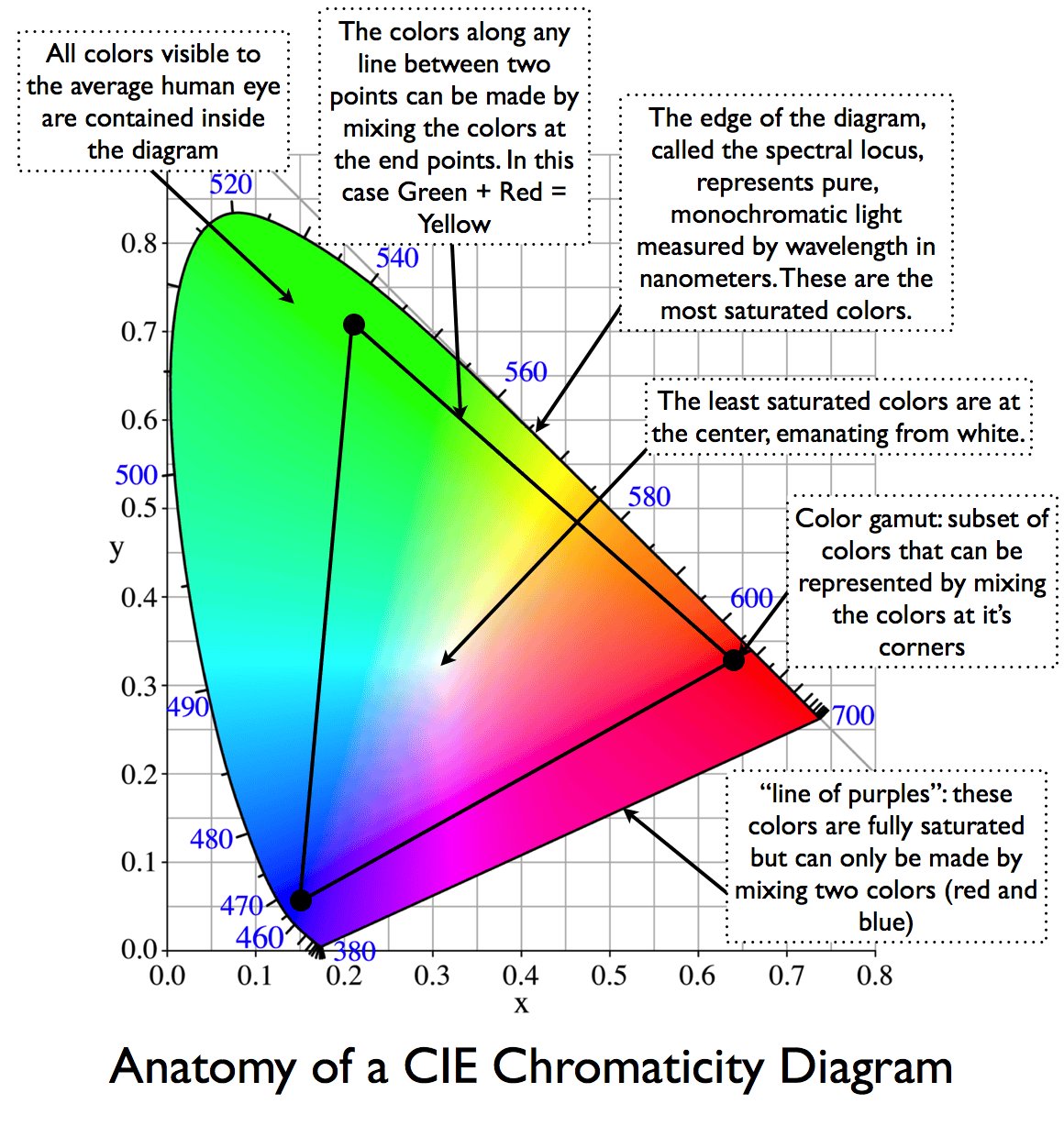
Problem solved: there was no device‑independent, shared coordinate system for “color”.
We need a 3D coordinate system, independent of any particular device, to measure color. Through color‑matching experiments, CIE defined virtual primaries and obtained XYZ (with Y roughly proportional to physical luminance), and derived xyY as a chromaticity representation. The xy chromaticity diagram has since become the base coordinate system for nearly all later gamut diagrams and device characterization.
When a TV or monitor boasts “99% sRGB / 90% DCI‑P3 coverage”, the little polygon you see is almost always drawn on the CIE 1931 xy chromaticity diagram.
CIELAB and OKLab: perceptually uniform Cartesian spaces
Problem solved: geometric distances in XYZ/xyY do not match perceived color differences, so ΔE cannot be read off directly and lightness/chromacity axes are not perceptually uniform.
CIELAB applies a nonlinear transform to XYZ, yielding L* (lightness) and a*/b* (red–green and yellow–blue opponent axes). Distances in this space (ΔE) approximate perceived color differences and have become a standard for industrial color tolerances. OKLab is a modern, re‑fitted perceptual space with better behavior in many cases, from which OKLCH (polar form) is derived.


When a paint or textile supplier reports a tolerance like “ΔE ≤ 1/2/3”, it is usually computed in CIELAB or a similar perceptual space. Some modern design tools already support gradients in OKLCH.
CIELUV (L*u*v*): a sibling perceptual space to LAB
Problem solved: non‑uniform perception of lightness and chromaticity in xy/XYZ, especially for additive light use cases (displays and lighting).
CIELUV, defined alongside CIELAB in 1976, applies a different nonlinear transform to XYZ, yielding L* (lightness) and u*/v* (chromaticity coordinates). For additive‑light scenarios, L*u*v* and its u*v* chromaticity plane often give distances that better track perceptual differences than xy. LAB is more entrenched in industrial color‑difference standards (ΔE) and reflectance/pigment workflows; the two spaces are complementary but both are device‑independent and designed for perceptual uniformity.
CIECAM02 / CAM16: color‑appearance models that include viewing conditions
Problem solved: the same physical stimulus (same XYZ) can look different under different viewing conditions (luminance level, surround, white point).
Color‑appearance models explicitly incorporate viewing conditions and predict appearance attributes such as J (lightness), C (chroma) and h (hue). CAM16‑UCS provides a more perceptually uniform coordinate system on top of this and forms the perceptual basis for HCT and LPS discussed later.
The same photo viewed in bright daylight vs in bed at night with the lights off will “look” different overall—the combination of screen and surround shifts how bright and saturated it appears. Color‑appearance models formalize such effects and are a theoretical basis for HDR tone‑mapping and adaptive themes.
The RGB family: serving industrial reproduction and encoding
Device RGB and linear RGB: starting point for industrial color mixing
Problem solved: connecting abstract CIE coordinates to “how a device should emit light to match a target color”.
A concrete display or luminaire chooses three primaries and a white point, then uses a matrix transform between CIE XYZ and device linear RGB. The device’s gamut is the polygon formed by those primaries on the xy diagram. Stage lighting rigs, LED walls, etc. adjust R/G/B (or more channels) to “mix” toward a target CIE color; this is industrial color mixing in linear RGB space.
On a concert lighting console, the operator is adjusting R/G/B values, but the goal is often “make the stage match this brand color swatch as seen by the audience”.
sRGB: the de‑facto standard for the web and consumer devices

Problem solved: without a shared color gamut and gamma convention, images and devices would render colors inconsistently.
sRGB fixes a set of primaries and a D65 white point, and uses a gamma ≈ 2.2 transfer curve that optimizes dark‑tone steps for 8‑bit encoding, balancing display capabilities, file format constraints and the eye’s lightness sensitivity. sRGB implicitly bakes in a default white point and gamma, driven more by engineering and compatibility than by strict perceptual uniformity.
Why is it hard for a camera to capture sunsets as explosively red‑orange as they look to the naked eye? Real sunsets often live outside the sRGB gamut. The pipeline from sensor to sRGB file compresses or clips out‑of‑gamut colors, and most consumer displays are only sRGB or slightly wider, so the final result naturally looks “less intense”.
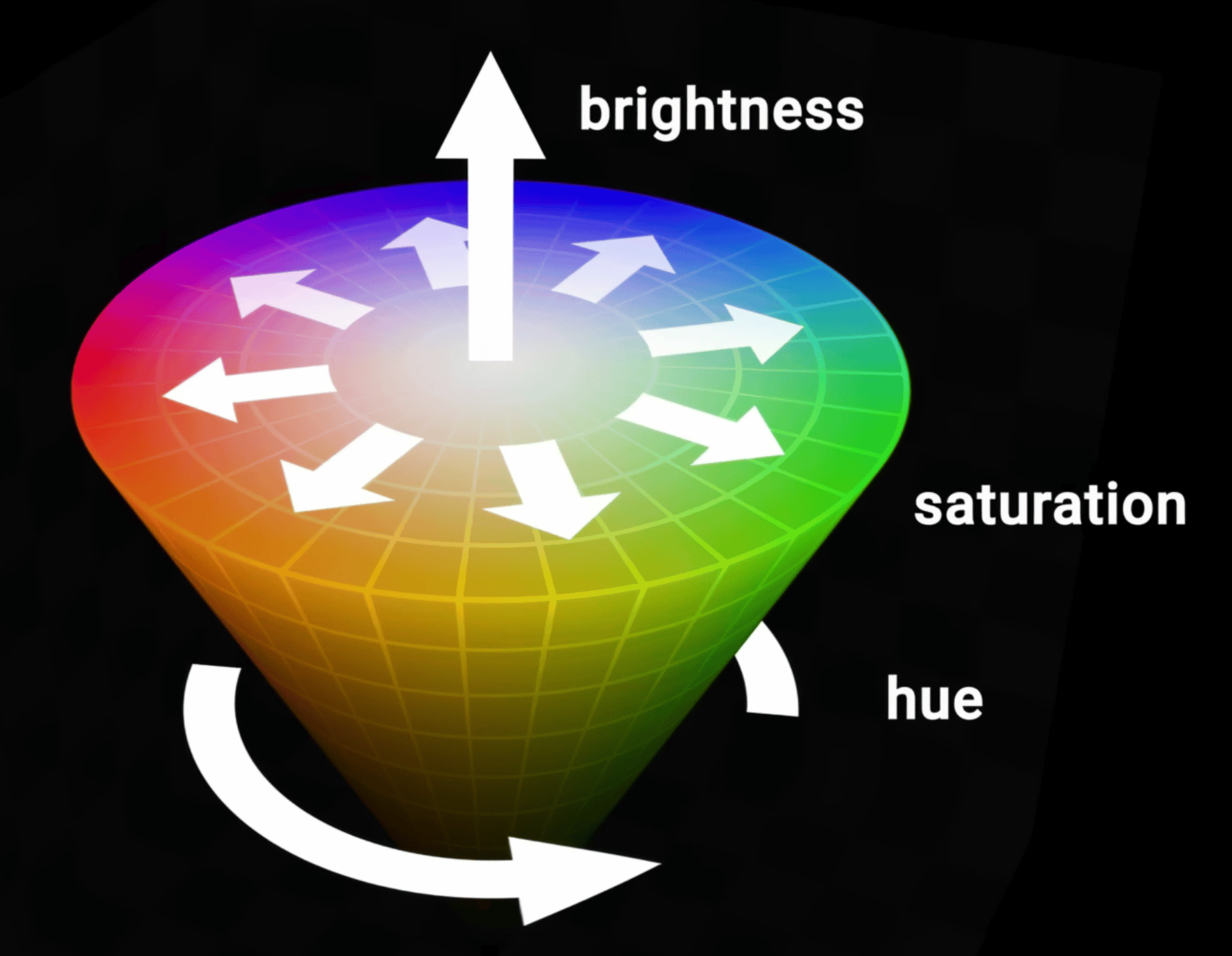
HSL / HSV: intuitive UI color spaces (and their gradient problems)
Problem solved: raw RGB channels are not intuitive for humans to tweak; designers think in hue, saturation and lightness/value.
HSL/HSV geometrically remap the RGB cube into cylindrical or conical coordinates (Hue + Saturation + Lightness/Value), making it easy to “rotate hue” or “pull up brightness and saturation”. But these axes are purely geometric rearrangements of RGB and are not perceptually uniform. Equal steps in H/S/L do not look like equal steps to the eye.
In front‑end work, it is common to see a
linear-gradientbetween two brand colors that looks muddy, dull or has an odd lightness bump in the middle. That is because straight‑line interpolation in RGB/HSL corresponds to a curved, often gray‑skewed path in a perceptual space. HCT and LPS later address this by interpolating in more perceptually friendly spaces.
Summary: CIE family vs RGB family
- CIE spaces answer “how does the eye see?”, “how big is the color difference?”, “what happens if the environment changes?”. Their mission is perceptual modeling and measurement.
- RGB‑family spaces answer “how should a device emit or render light?”, “how do we encode images?”, “how does industry mix to a target color?”. Their mission is reproduction and implementation.
What problem each color space solves
| Color space | Problem it solves compared with what came before |
|---|---|
| CIE 1931 XYZ / xyY | Establishes a device‑independent coordinate system so “color” can be measured consistently. |
| CIELAB & OKLab | Makes geometric distance better match perceived color difference, so ΔE is meaningful and axes are usable. |
| CIELUV | Improves perceptual uniformity of lightness and chromaticity for additive‑light scenarios over xy/XYZ. |
| CIECAM02 / CAM16 | Incorporates viewing conditions so the same XYZ under different environments can be predicted to look right. |
| Device RGB & linear RGB | Connects abstract CIE coordinates to concrete device primaries for industrial color mixing and control. |
| sRGB | Standardizes gamut and gamma across devices and image files to reduce display inconsistency. |
| HSL / HSV | Provides more intuitive hue/saturation/lightness knobs than raw RGB for UI and design workflows. |
HCT builds on CIE’s perceptual modeling while serving front‑end and visualization engineering.
HCT: how it works and how to use it in practice

From HSL/CIELAB to HCT: pain points and goals
HSL/HSV often produce muddy midpoints and uneven lightness in interpolations and palette design. CIELAB/OKLab have much better behavior for color differences and perceptual uniformity, but there is still a gap between them and contrast guidelines, device gamuts and day‑to‑day engineering needs. HCT aims to provide a workspace tightly aligned with accessibility (contrast ratios), front‑end implementation and visualization workflows.
Comparing gradients in OKLCH or LCH(ab) versus gradients in RGB/HSL is a good way to build intuition for why perceptually friendly workspaces like HCT are designed.
HCT: definitions and semantics of Hue / Chroma / Tone
- Tone (T): uses CIELAB L* in the 0–100 range and is directly related to WCAG contrast ratios.
- Hue (H): hue angle from CAM16, 0–360°.
- Chroma (C): CAM16 chroma, indicating how vivid the color is.
At fixed Tone, Hue controls “which color family” it is, and Chroma controls “how strong” it is. This is more intuitive than HSL’s axes.
HCT computation pipeline (ARGB ↔ HCT)
ARGB → HCT: parse ARGB into R/G/B, linearize, transform via a matrix to CIE XYZ; apply CAM16 under default viewing conditions to obtain hue and chroma, and derive CIELAB L* from Y as Tone.
HCT → ARGB: given (H, C, T), search within the sRGB gamut for a color whose CAM16 hue ≈ H, tone ≈ T, and chroma as close as possible to C, while keeping RGB channels in [0, 255]. The HCT solver (HctSolver) uses Newton iteration plus bisection to perform this search. This lets us drive UI/visualization in perceptually friendly (H, C, T) while still landing robustly in ARGB/HEX.
Advantages and limitations versus traditional spaces
Advantages: compared with HSL/RGB, doing interpolation and palette construction in HCT follows paths that better match perceptual intuition, producing more natural gradients and palettes. The H/C/T axes also map well to everyday design needs, making it easier to build systematic theme scales while maintaining contrast targets. Conceptually HCT fits the same philosophy as OKLab: go to a perceptual space first, do geometry there, then return to RGB.
Limitations: the numerical solver depends on specific viewing‑condition assumptions and an sRGB‑gamut constraint, so very high‑chroma colors or wide‑gamut devices can still expose approximation errors or clipping. Different devices and environments may ultimately call for updated perceptual models or new derived spaces to complement HCT.